


Powerpoint presentation:

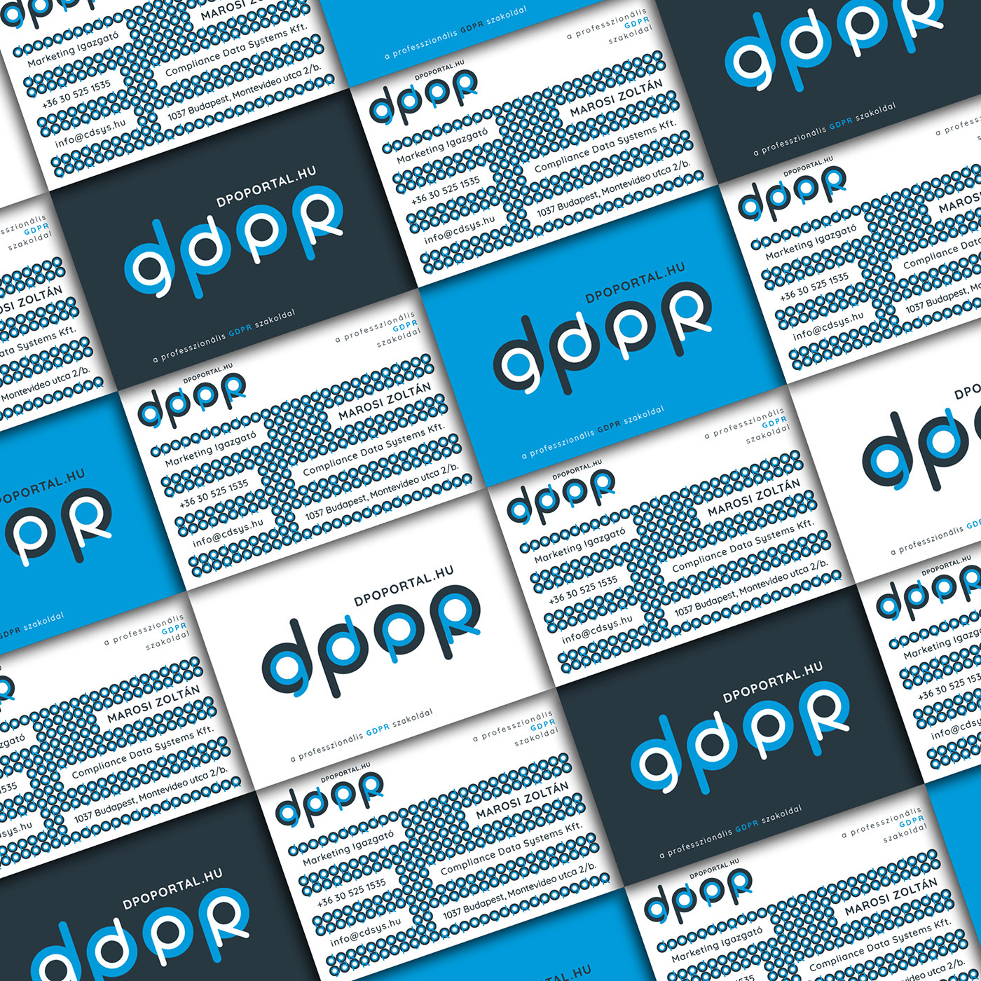
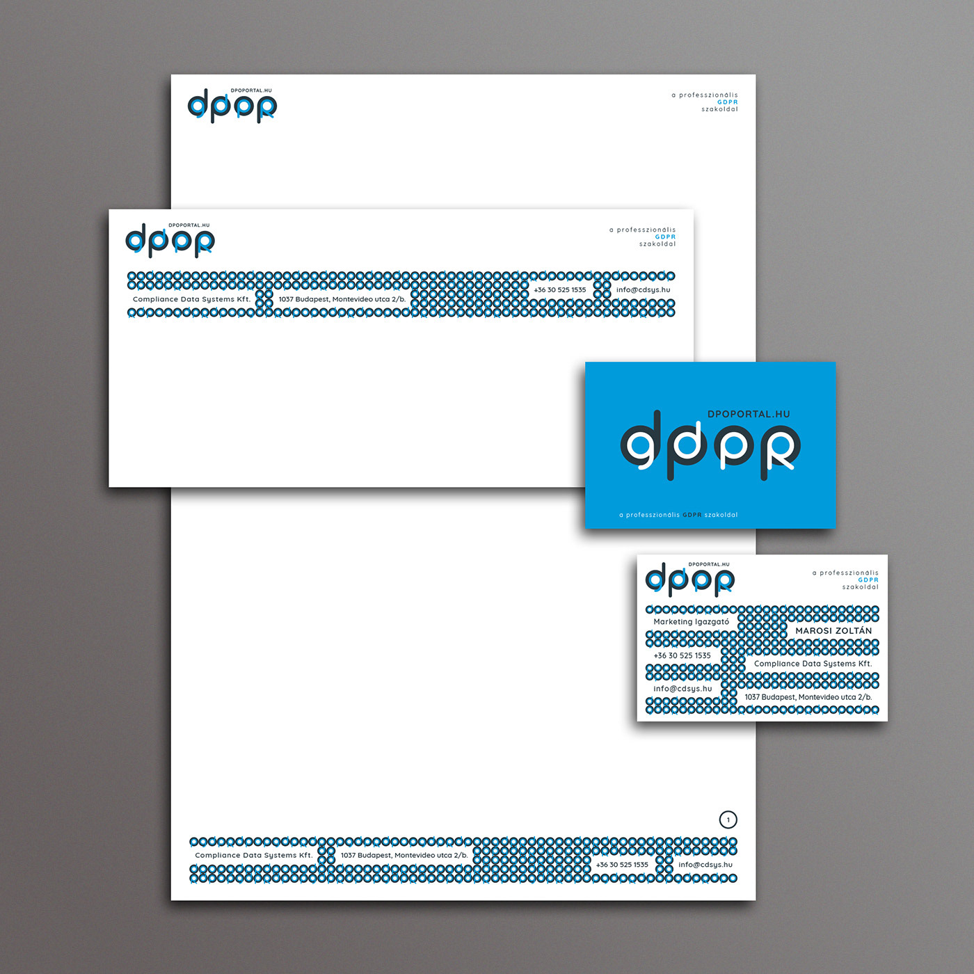
An information security company has commissioned me to design a brand identity for one of their main projects, the DPO Portal (DPOP). DPOP is a GDPR specialist site where professionals and those who are interested in this topic can access up-to-date and practical information that can help them in their everyday work. Recognizing that both the project name and the topic name consist of 4-4 characters, from the beginning of the creation of the logo, my goal has been to combine the acronyms DPOP and GDPR in some way to stem from each other. This is how this "TYPO ENCLOSED IN TYPO" concept came into being. With this inclusion, it also symbolizes a sense of security, which also reinforces the theme. The other elements of the brand identity are based on an essencial pattern, which is based on the main shape of the logo. In the pattern, the enclosing shapes are the concentric circles. Their line thickness equals to the inscription "DPOP" line thickness. These circles contain repeating elements consisting of the letters "gdpr" and "dpop" (gdprdpopgdprdpop ...). This vibrating pattern symbolizes the encryption (like digital encryption or a physical printed encryption which protects for example a pin code).