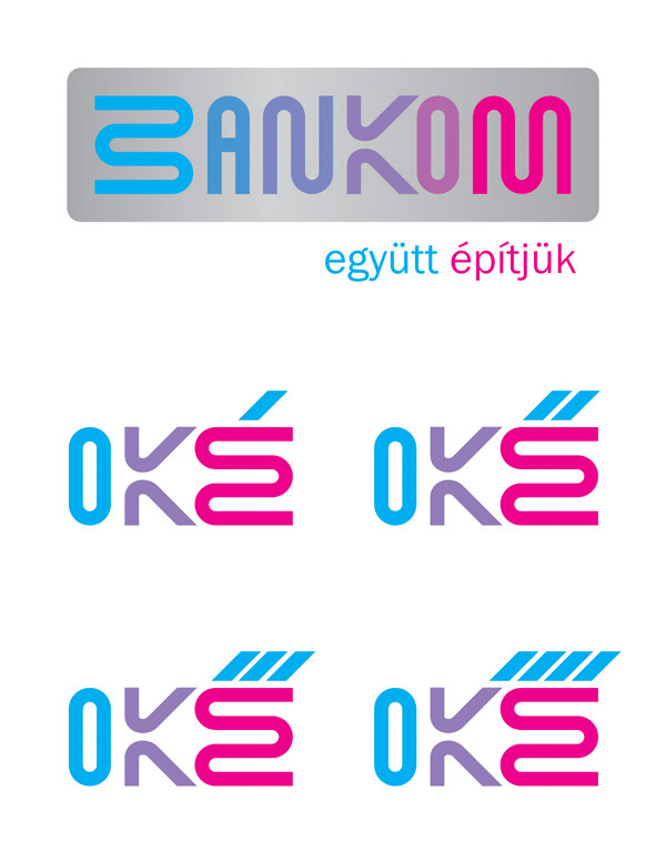
BANKOM - a new bank logo and OKÉ1234 bank account product line logo concept

DIREKT PONT - logo for temporary banking places (AXA BANK HUNGARY)
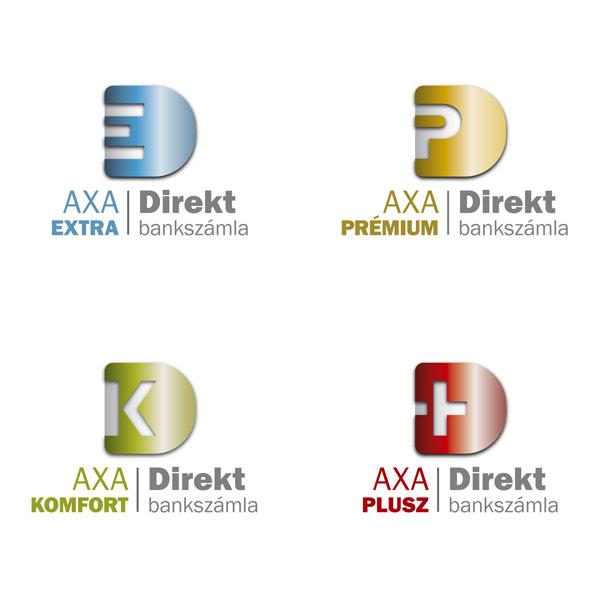
DIREKT BANK ACCOUNT PRODUCT LINE - (AXA BANK HUNGARY)

ELLYPSZILON - design, game and book publishing (Ellypszilon Kft.)
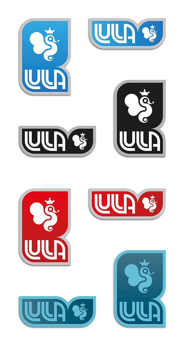
LULLA GAMES - brand logos for boardgame publishing (Ellypszilon Kft.)
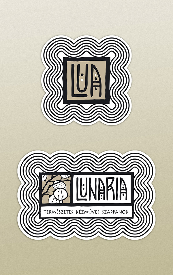
LUNARIA - handmade natural cosmetics manufacturing
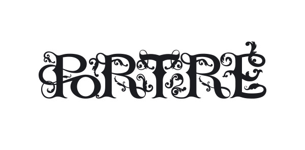
PORTRÉ - typography for a historical novel

SAMADHI SHOP - buddhist shop

SIHIR - logo for an oriental music and dance production
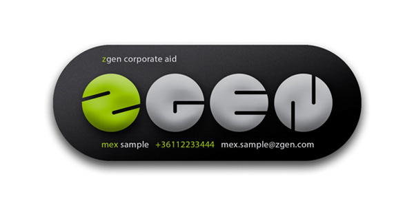
ZGEN - corporate aid and consulting
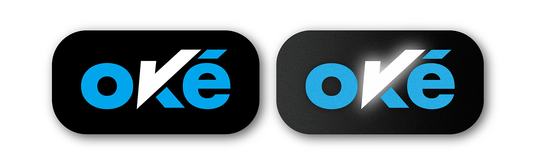
OKÉ BANK ACCOUNT PRODUCT BASIC LOGOTYPE - (AXA BANK HUNGARY)
The name OKÉ was found out by a famous Hungarian advertising company. The basic idea was
The name OKÉ was found out by a famous Hungarian advertising company. The basic idea was
that this name would be the ending of special expressions appearing in the campaign as a play on words.
Example: bajnokoké means champions’ , határtalanoké means of the boundless.
So at the beginning of the designing process it was an important aspect to make the logo insertable into a continous text. The goal was to design a logo that fits into the basic image of Axa Bank, but can create its own visual world within.
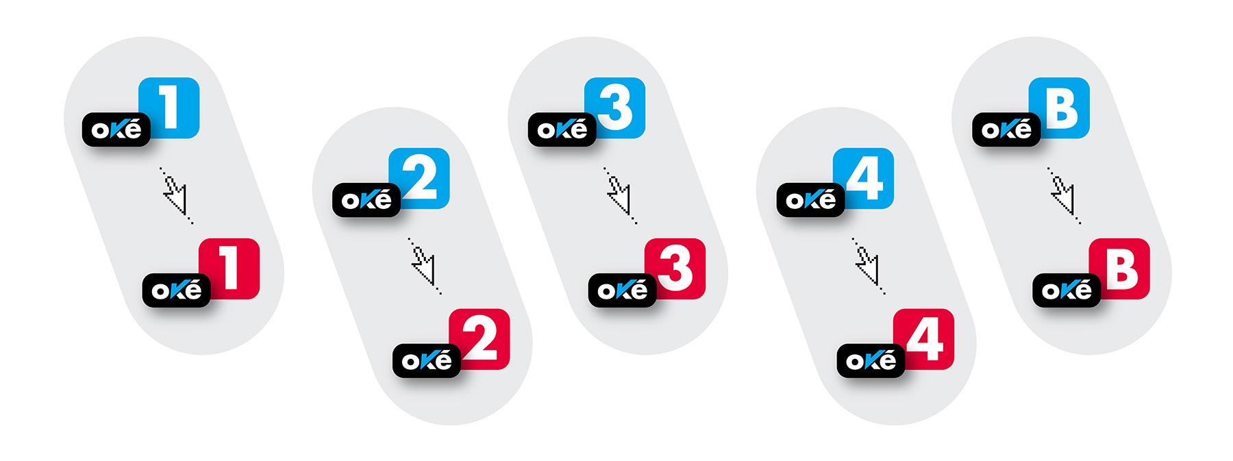
OWN LOGOS OF OKÉ 1, 2, 3, 4 CHARGE ACCOUNTS AND OKÉ DEPOSIT ACCOUNT - (AXA BANK HUNGARY)
The blues are the basic types, reds if mouse over in online surfaces.
The blues are the basic types, reds if mouse over in online surfaces.

OKÉ BANK ACCOUNT PRODUCT LINE LOGOTYPE (4 in 1) - (AXA BANK HUNGARY)
During the campaign we needed a solution for the problem of showing which accounts of the four the ad refers to, while the whole product line is visible.
It was important to make the hierarchy of the accounts clear at the same time, since the bigger its number is, the more complex and favorable the product is.
In all cases the blue ones are the one that the ad refers to, the grey ones are inactive.
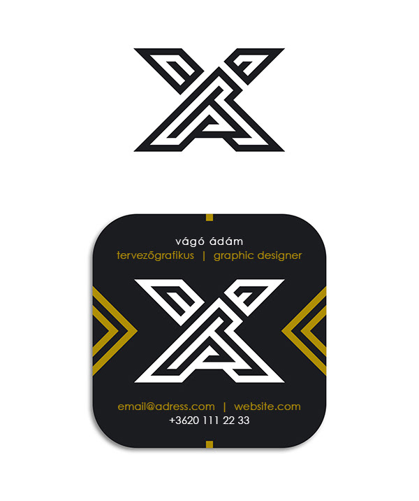
Monogram and card - 2016