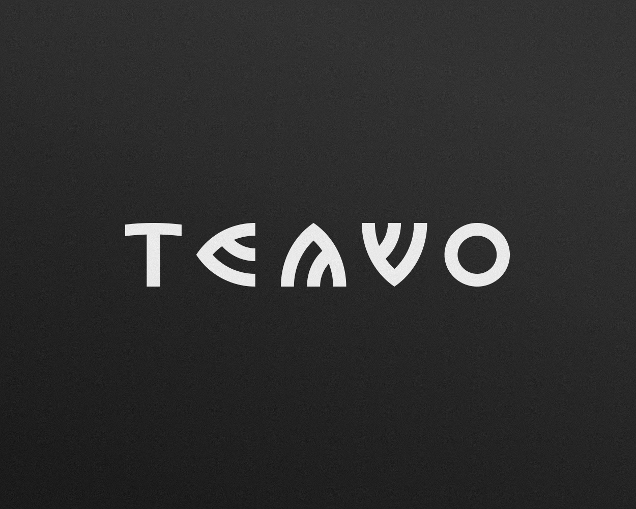
2. logo concept
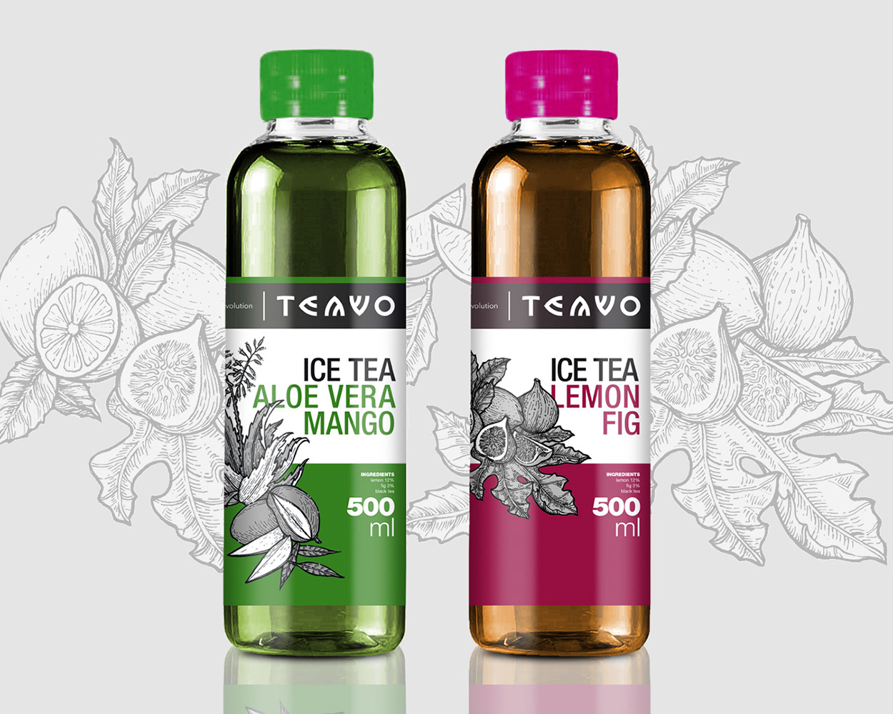
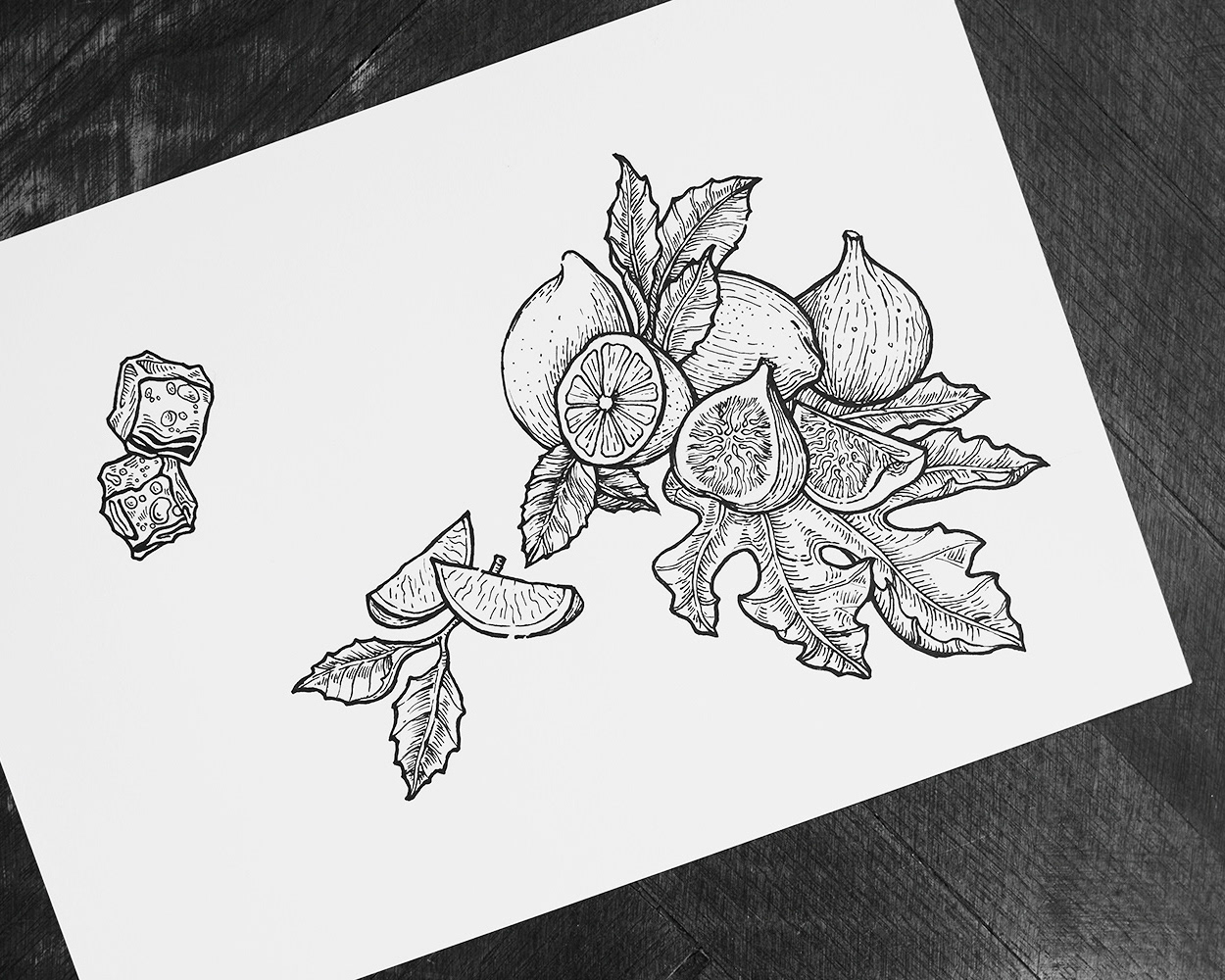
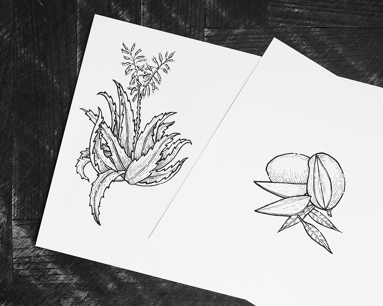
TEAVO - A visual concept (logo and packaging design) for a new type of ice tea. The brand name Teavo came from the fusion of two words: tea & evolution. The company had a preliminary concept for a strong and future style logo with sharp & straight edges, but I tried to soften it with arcs to be a little bit more organic however with a modern feeling. The visuality of the concept works simultaneously with contemporary purity and with the woodcut/etching illustrations of the classical encyclopedias. The final result is an elegant packaging of a quality product.